
What cholera can teach us about data governance
On August 31st, 1854, a major outbreak of cholera swept through the Soho district of London. This would later be named the ‘Broad Street Outbreak’ after the street near where it occurred, and at the time, physicians in London disagreed on how cholera was spread. Over the next 10 days, this outbreak would result in the deaths of over 500 residents.
The dominant theory was that cholera was transmitted via airborne ‘Miasma’ particles. A physician by the name of John Snow was skeptical of this theory and conducted interviews of residents in the affected areas to learn more. He documented his findings in a dot map, which charted cholera cases by street address. The results of this showed a correlation between infections and water sources used by residents, leading to the discovery of germ-contaminated water being the source of cholera.
Original map by John Snow showing cholera cases in the 1854 London epidemic

Across London, it was discovered that there were much higher rates of cholera in neighborhoods supplied by water drawn from the River Thames. Other neighborhoods, supplied by different sources and filtered water, had lower rates of cholera and few deaths.
For an organization access to clean, reliable data can be as important as clean, reliable water is to a city. Most industries are changing too quickly for leadership to rely on intuition alone. However, as the volume and quantity of data sources increase, keeping track of what data is accurate, timely and relevant becomes exponentially more difficult. One of the key responsibilities of a data governance team is to be aware of what data assets the business is using and to ensure they have access to trustworthy sources.
Map out the sources
One of the most critical functions of a data governance program is understanding where business users go to get their information. Like John Snow’s approach, interviews are often the best route to discovering this. The data governance team should set up some time with key stakeholders from various areas of the business to find out how they interact with data to perform their job functions.
A big part of this is understanding the KPIs (Key Performance Indicators) leadership uses to measure their team. These are objective, discrete metrics, such as AR days, net revenue, orders delivered, churn rate or website page visits. They’ll vary by department, but there may be some overlap with components of these metrics. Once they’ve communicated what KPIs they are looking for, ask them where they go to get this information.
Business users often have multiple options to find data, and they will tend to use whatever is the most convenient or reliable. This could be going straight into the operational system, such as a resource planning or customer relationship tool, running organization reports or maintaining personal spreadsheets.
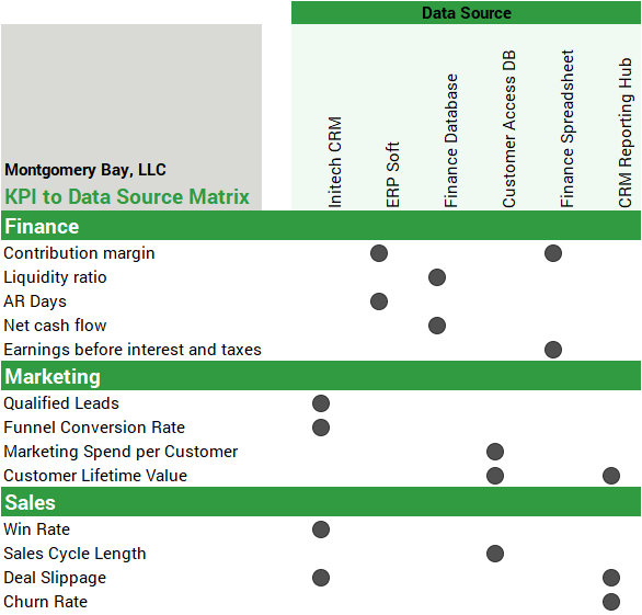
A helpful way to visualize this information is in a KPI to Data Source Matrix. This diagram lays out the various KPIs by department down the left-hand side of a matrix, and the different data sources across the top. The intersections are marked with where users are going to get this information.
Example KPI to Data Source Matrix
Filter out discrepancies
Like John Snow’s dot map, a KPI to Data Source Matrix will bring clarity to the sprawl of data sources and KPIs that make up an organization’s data landscape. The example here is a small one, but when there are tens or hundreds of KPIs and data sources, patterns will emerge. Here are a few key things to look out for:
Are there KPIs that can be found in multiple systems? If so, this presents a data integrity risk. There is always a chance that these are calculated slightly differently or out of sync with each other, which can result in discrepancies from different areas of the organization. To mitigate this risk, work with business users and information management to determine the standard definition of the metric and which source is the most reliable and accurate.
Are some data sources unreliable? During interviews, business users often disclose their low trust in certain data assets or cite specific problems. If this becomes a theme, it may be time to remove or disable the data source. After the discovery of the Broad Street water pump contamination, London authorities famously removed the handle so that residents couldn’t use it anymore. A similar strategy with your data sources can prevent uninformed business users from relying on inaccurate data.
Are business users creating shadow IT departments? Whether due to low trust in data sources or lack of resources from information management, business users sometimes feel compelled to create and manage their own data assets. This can become a problem when they duplicate or contradict data sources created and maintained by information management. To resolve these issues, bring these business users into the discussion with information management, instead of just scolding or ignoring them. These efforts can be supported and redirected by information management into methods which are compliant with data best practices.
Is the business flying blind? It may be that some business users are not using data to inform their decisions or monitor KPIs. If this is the case, the data governance team should work to verify the best sources of information to use and communicate these to the business so that they can take advantage of them.
Reliable data makes for reliable decisions
The foundation of any organization’s operations is the data it uses to make decisions. If that data is inaccurate, the resulting strategies can be as equally flawed. Creating a KPI to Data Source matrix is a simple exercise, but it can yield some powerful insights into the strengths and weakness within an organization’s data sources. Contact us to learn more about how our Baker Tilly professionals can strengthen your data governance practices and analytics platform.
